
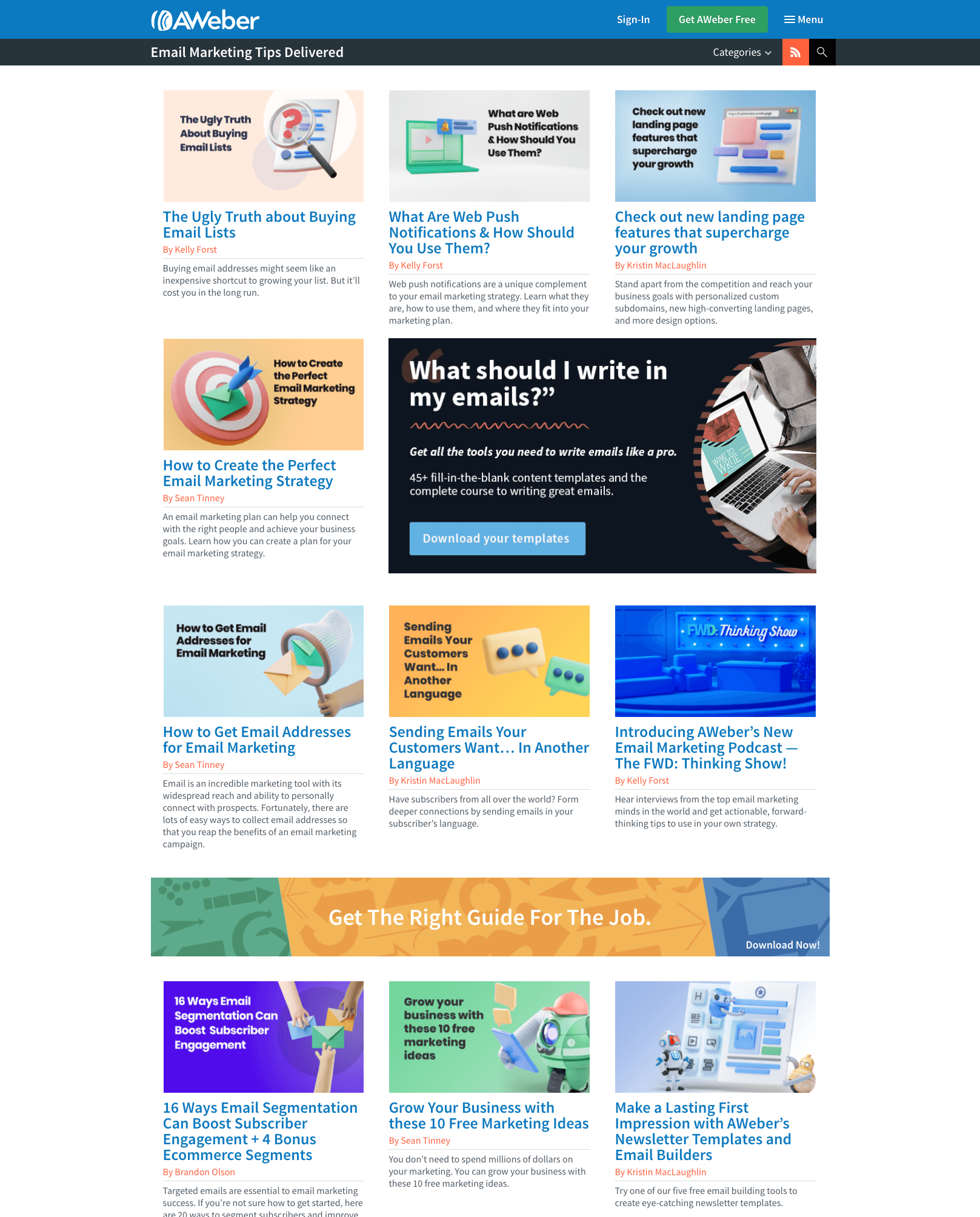
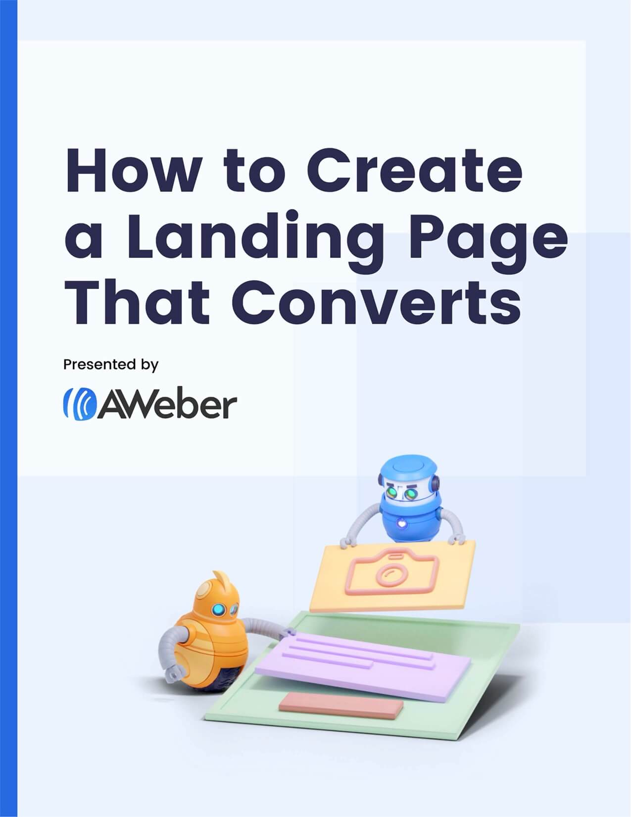
The original reintroduced
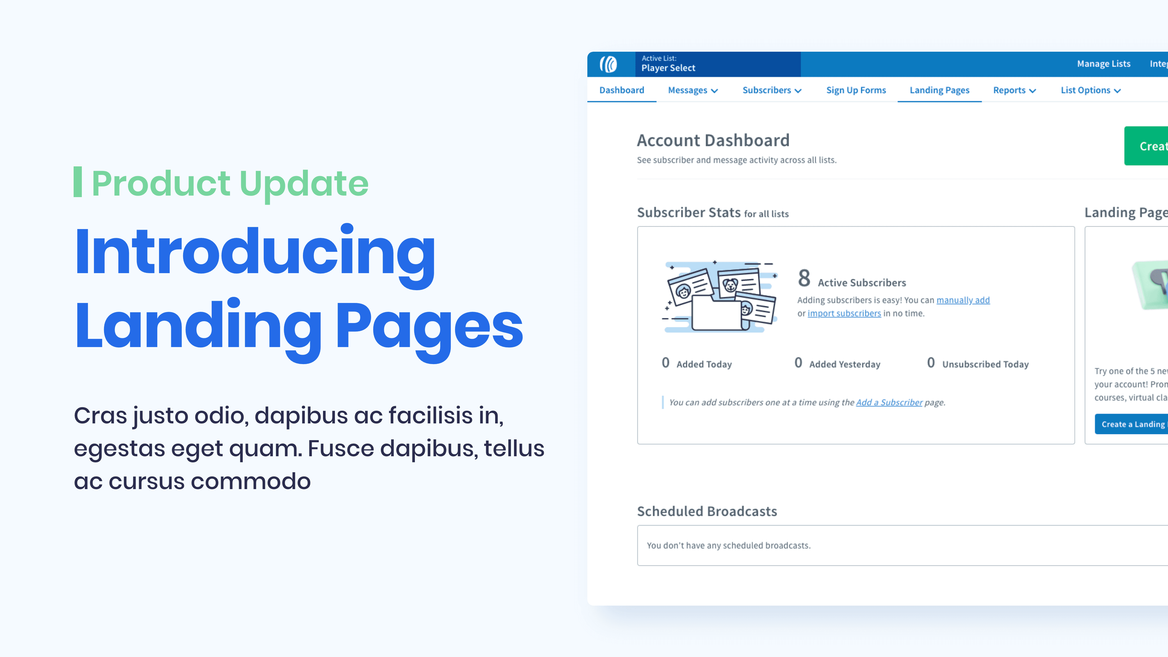
AWeber is one of the original email marketing platforms, founded in 1998 and built to make email automation accessible to small businesses before most people knew what a newsletter was. I joined as a Senior Designer on the UI/UX and Brand team, brought on to help modernize the visual identity and redesign the web experience across the marketing site. The work covered a lot of ground: landing page redesigns, customer-facing portals, a new 3D illustration system anchored on a cast of characters designed to introduce AWeber's automation tools, and a full suite of marketing and content assets. It all started with redesigning the pages people landed on first.
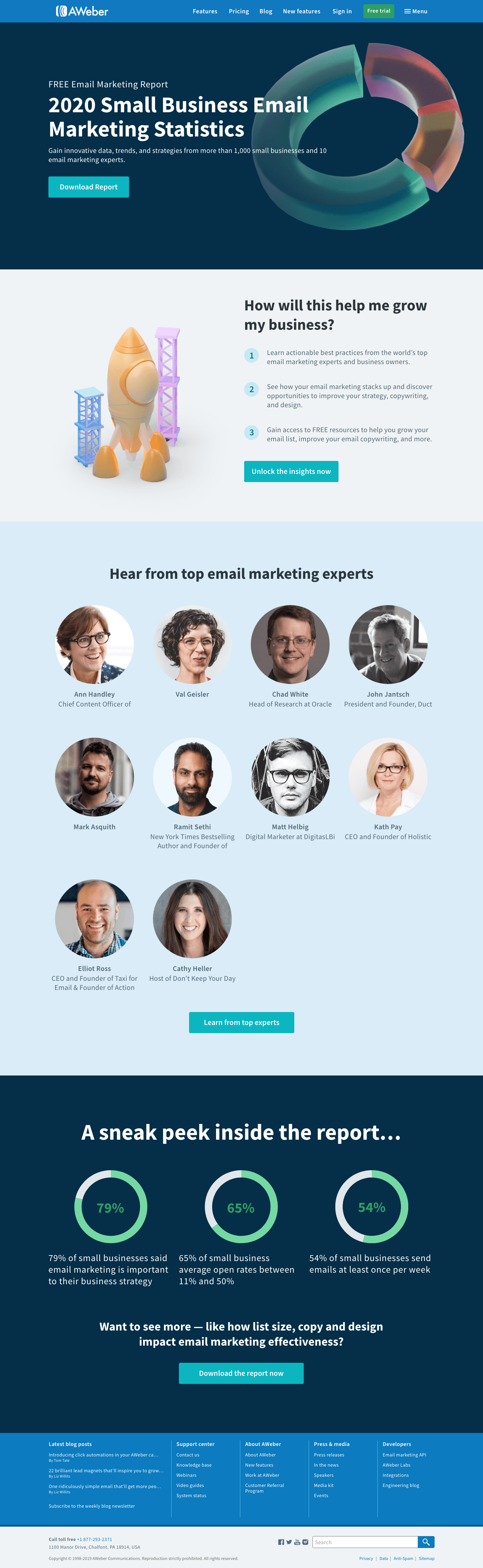
Sign-up landing page tests
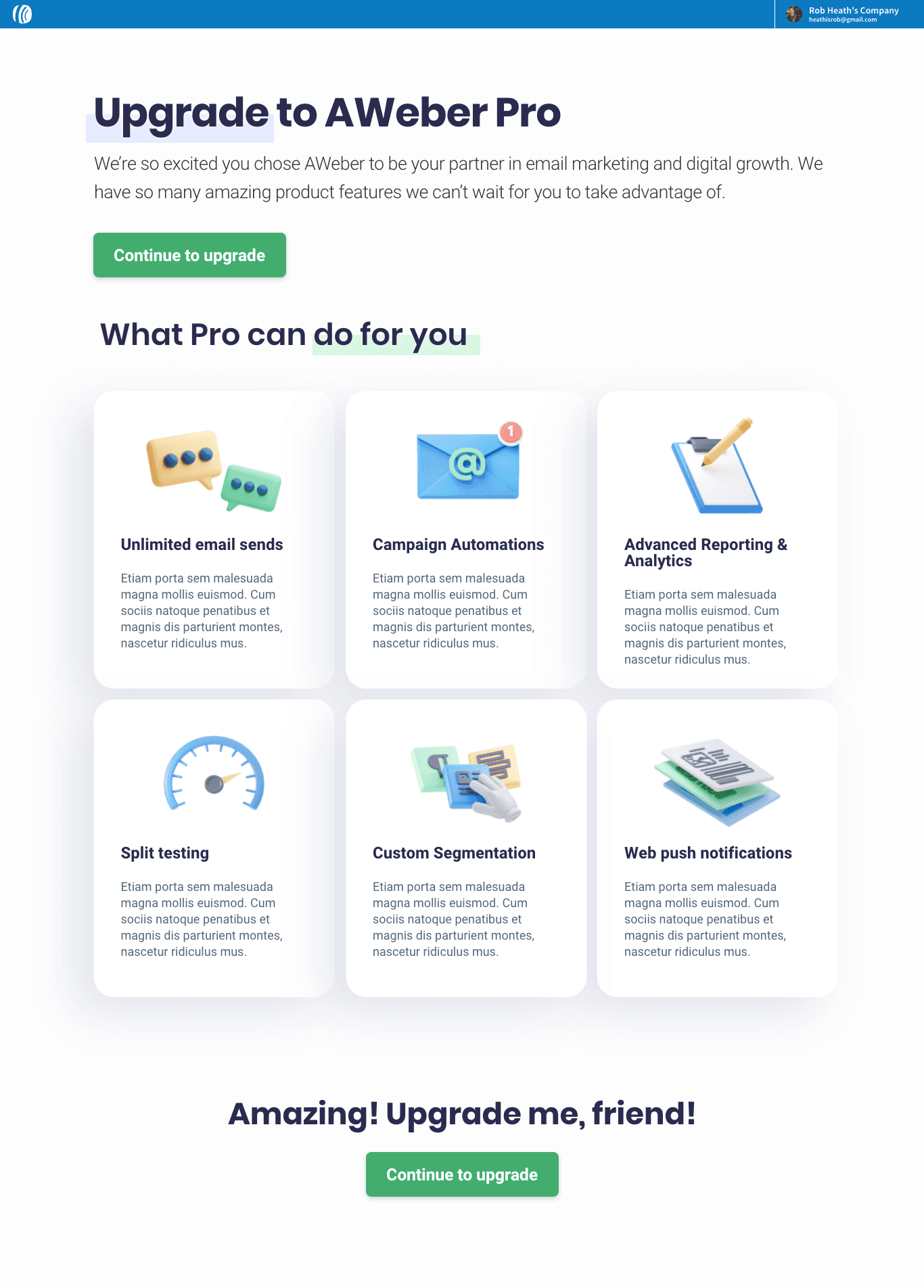
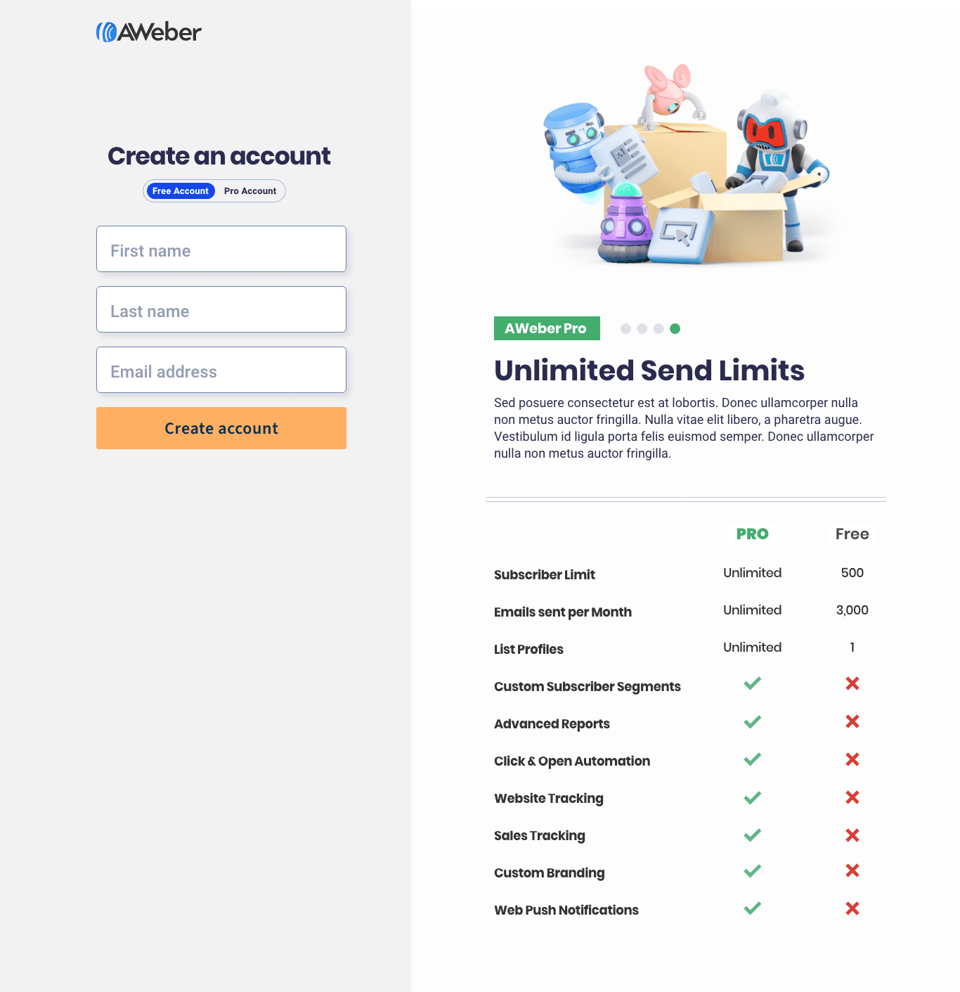
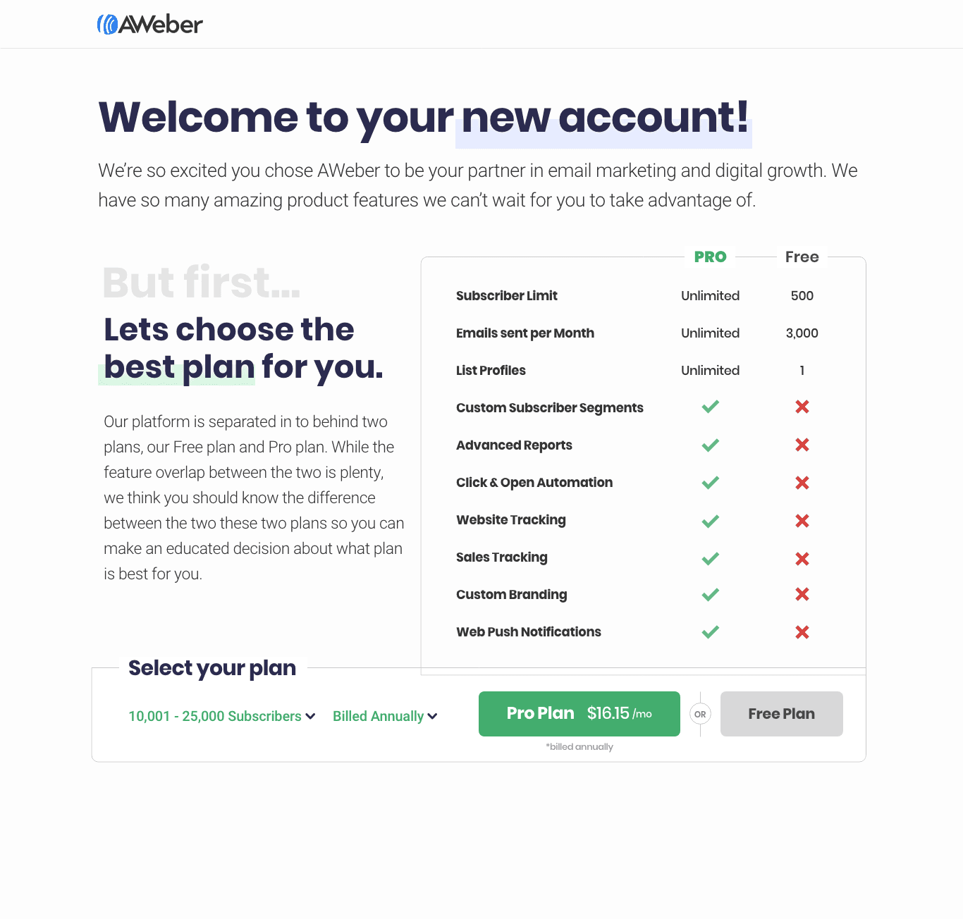
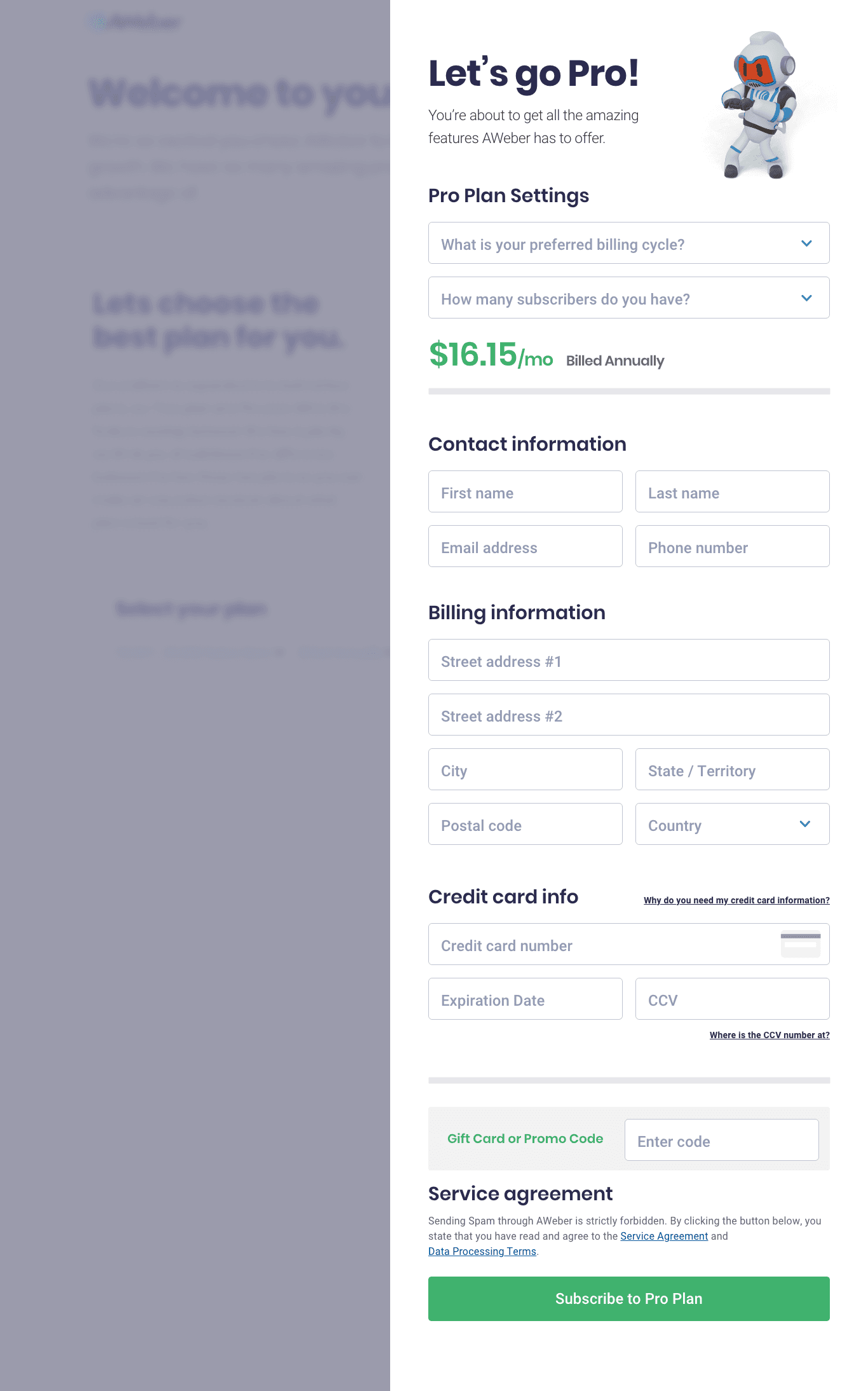
I continuously A/B tested sign-up flows in VWO. Layout, hierarchy, and visual treatment validated against live data before being promoted as the new base design. I tested countless first-time user sign up flows through my time at AWeber.
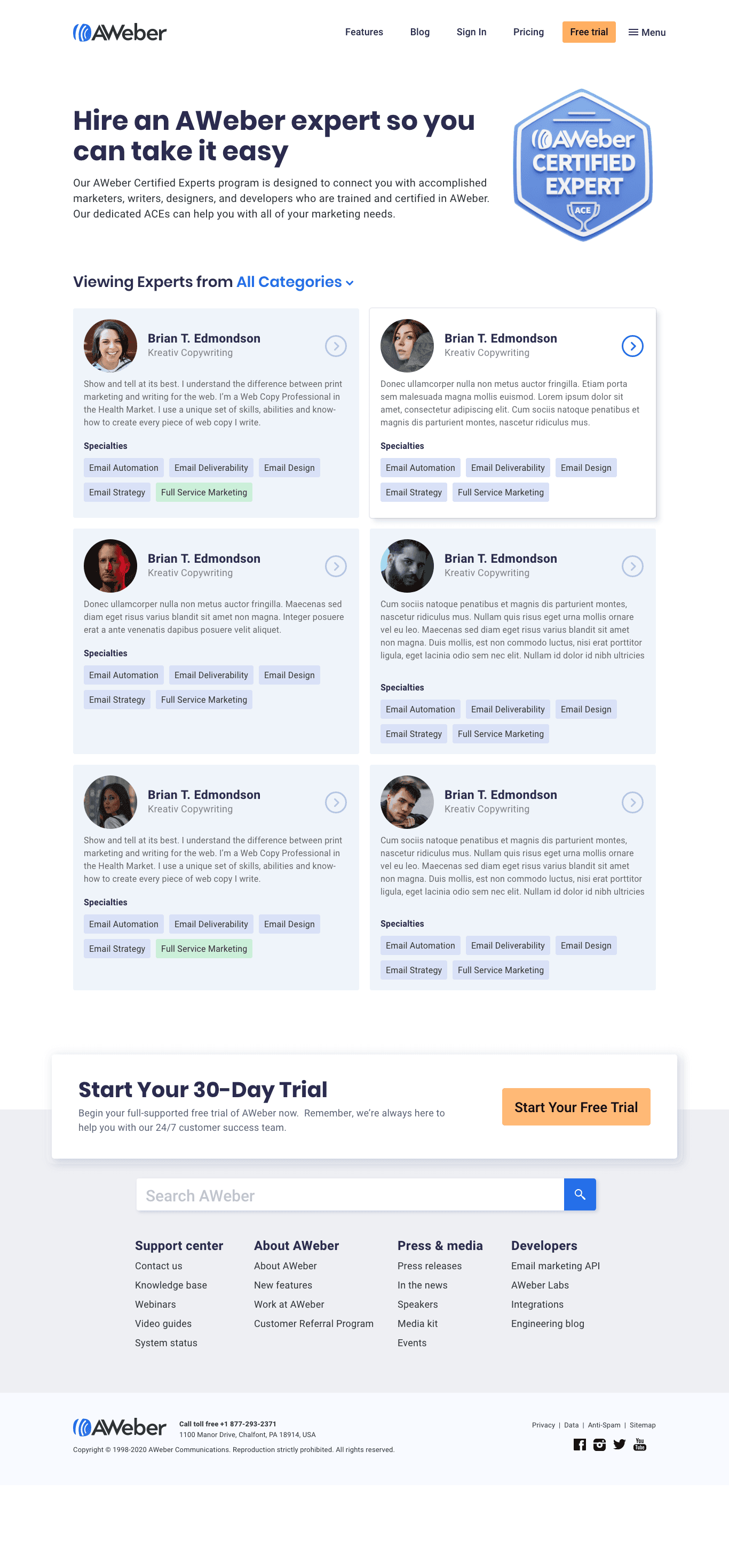
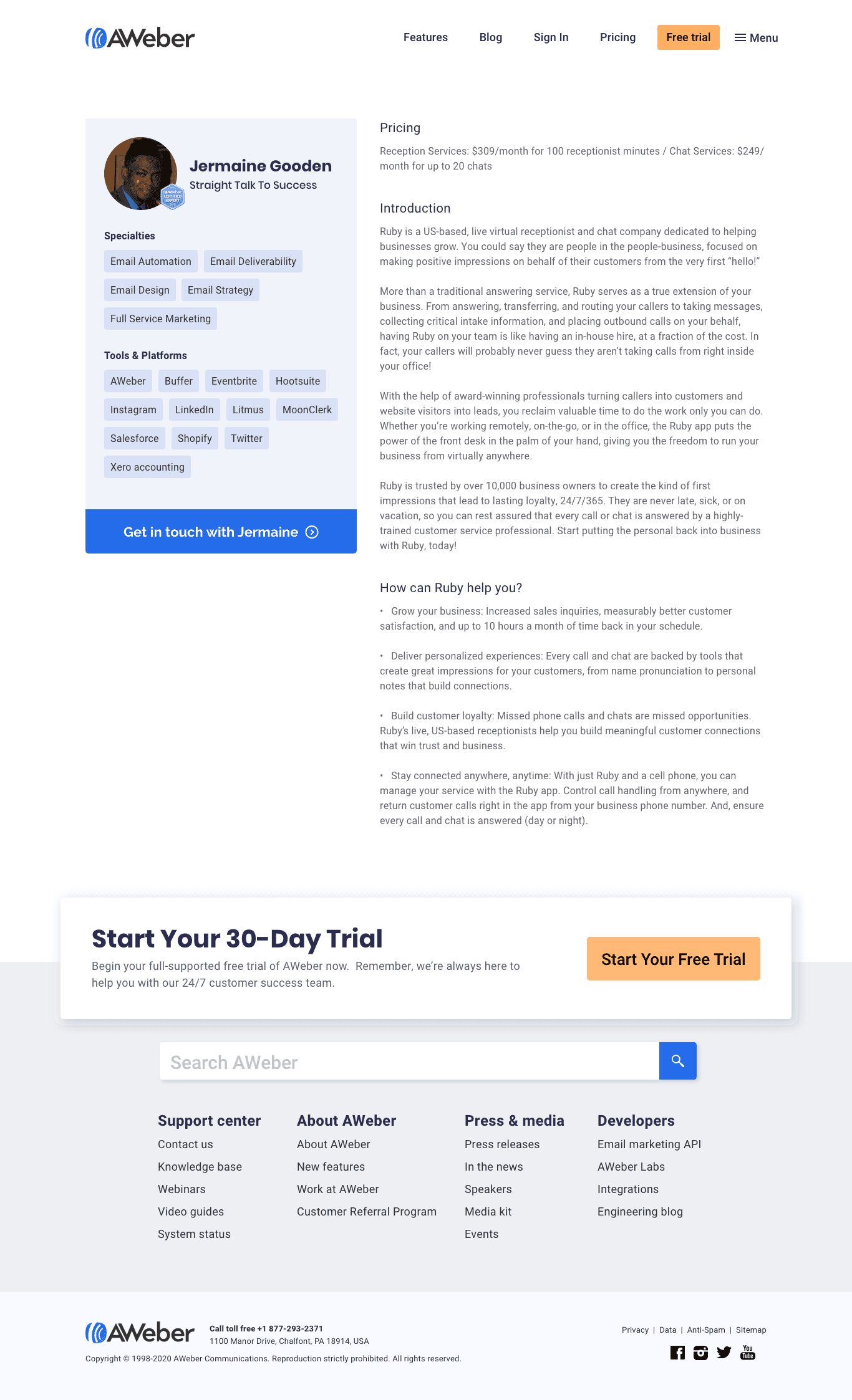
AWeber Experts portal
AWeber customers were asking for help writing their campaigns but had nowhere to turn outside of customer service. The Experts portal was conceived to solve that. A curated directory of certified email marketers and copywriters available for hire. I designed the the template pages, coded the front-end for the index and profile templates, and created the Certified Expert brand emblem that verified professionals could carry off-site.
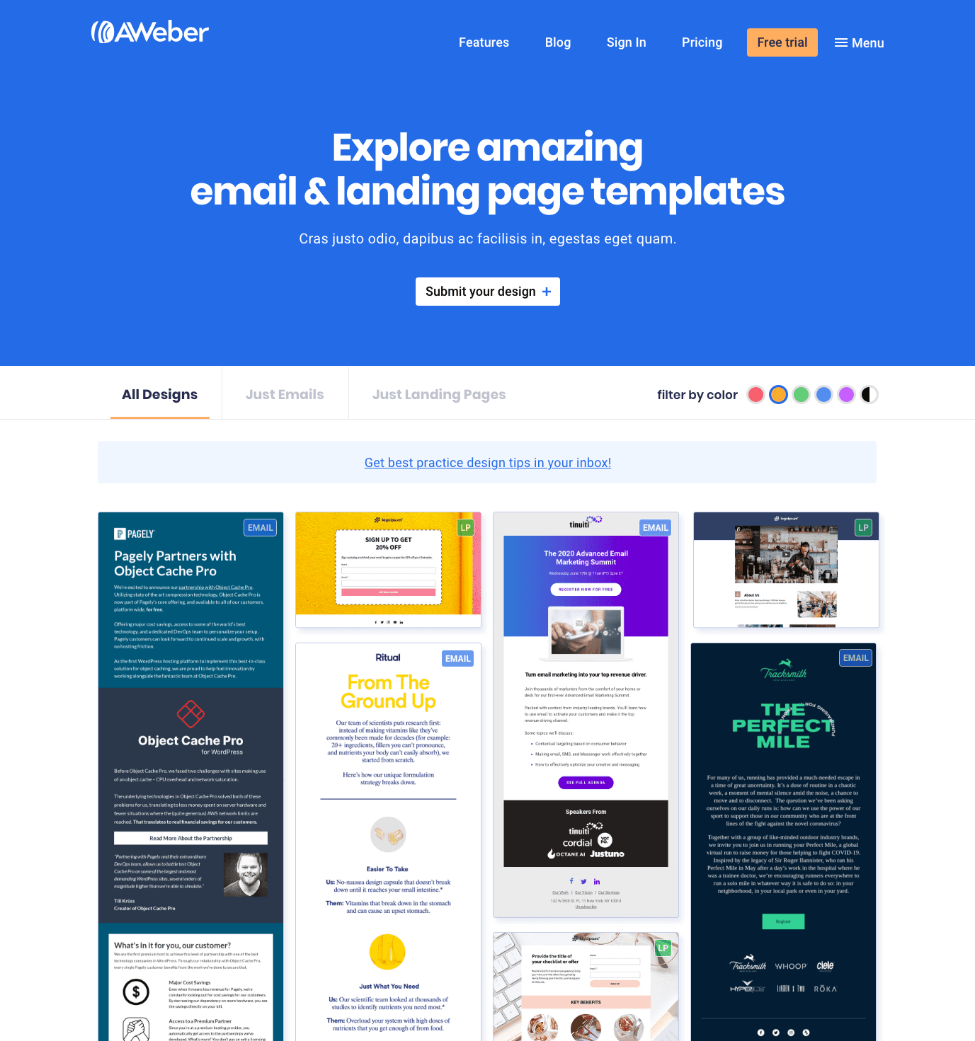
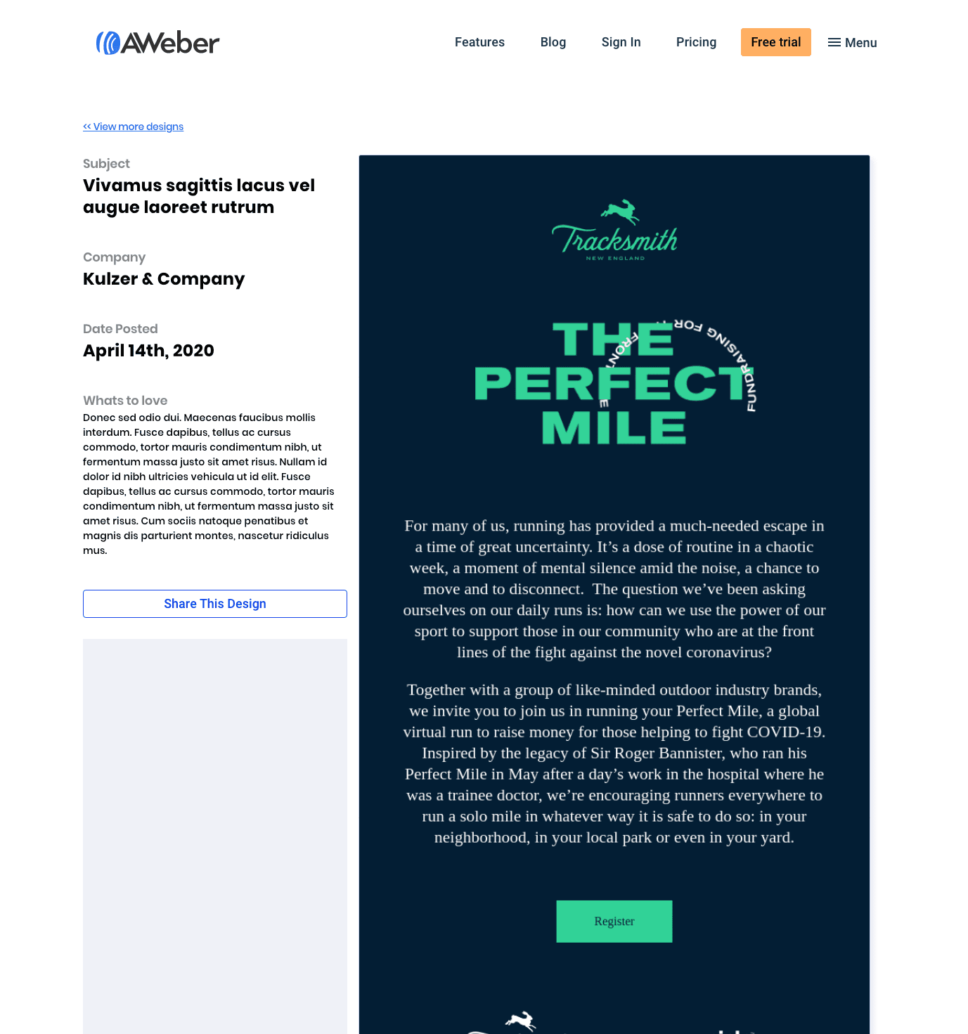
Template Design Gallery
We wanted to give our customers a serious creative boost, so we launched a massive gallery loaded with beautifully crafted email and landing page templates. My role was to bring that collection to life for the public. I built the entire marketing showcase from the ground up, turning our internal designs into a powerful growth engine that fueled both our SEO strategy and our display advertising campaigns.
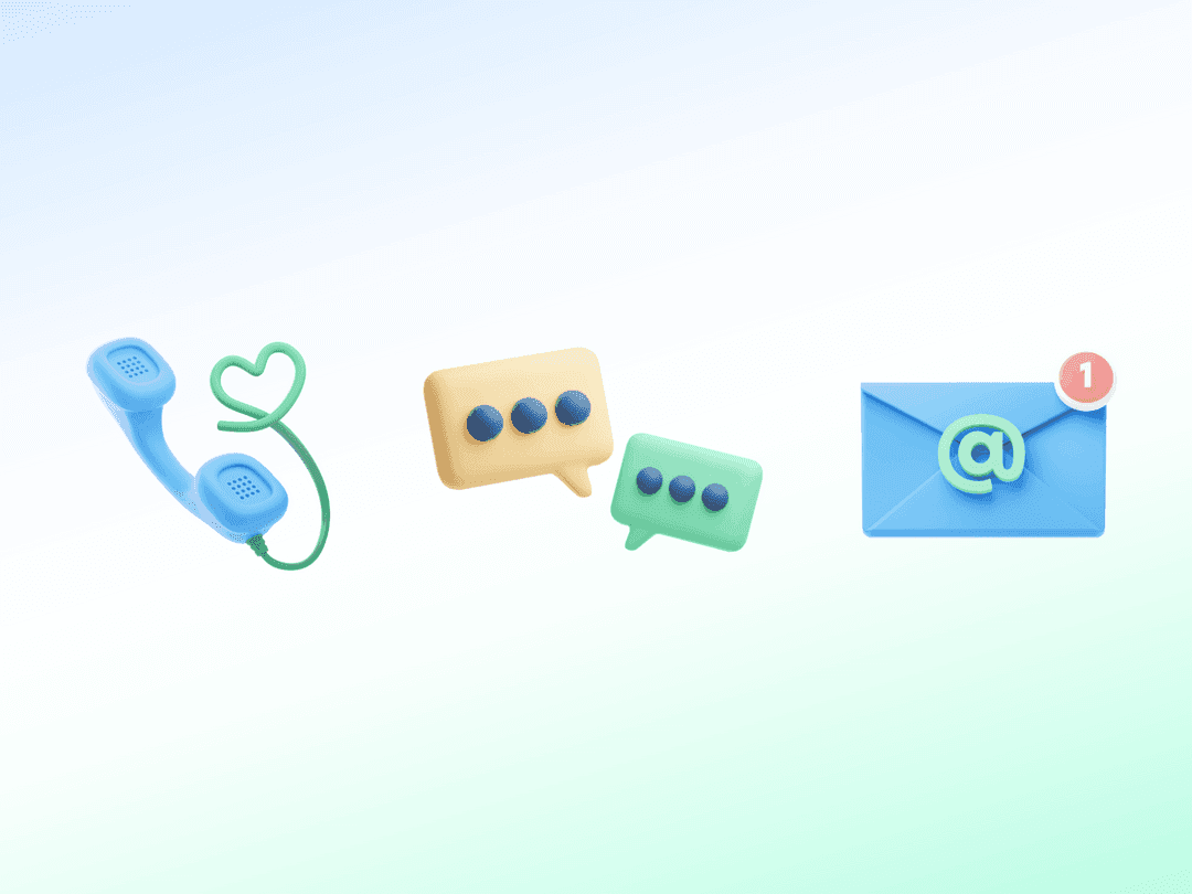
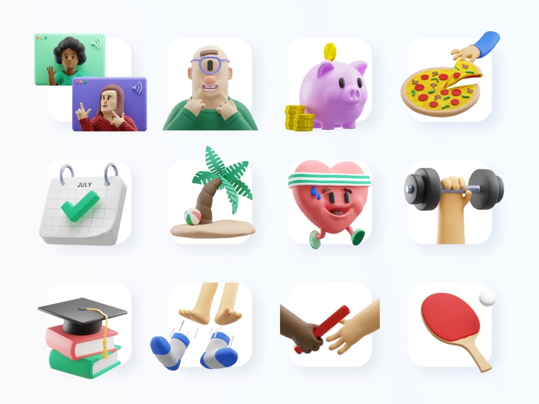
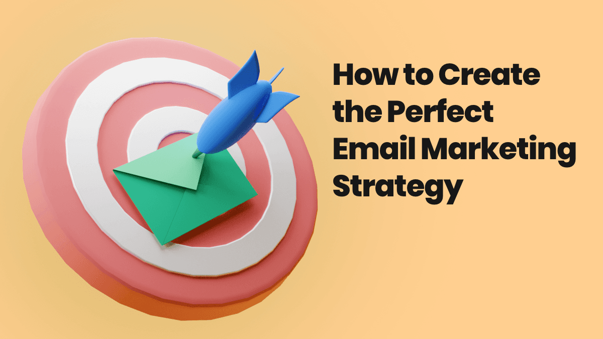
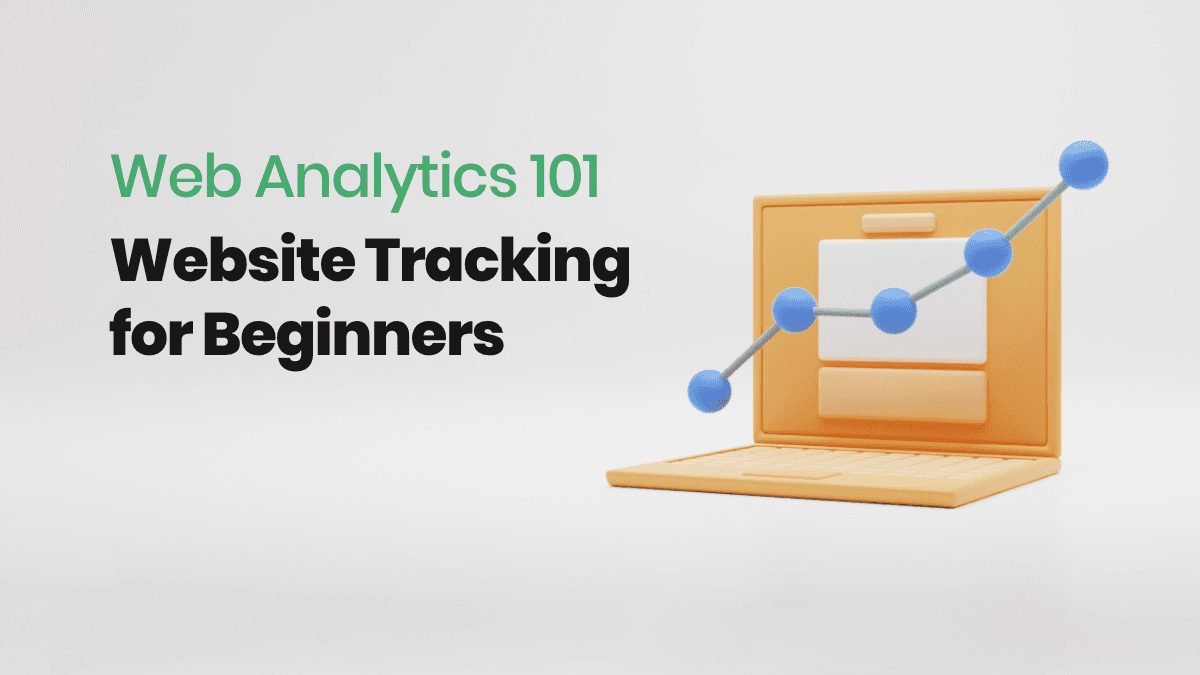
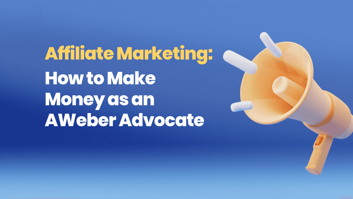
A visual language with depth
To give the brand refresh a distinct identity free from predictable stock photos and flat vector art, I crafted a massive library of custom 3D renders. These unique visuals brought a fresh, dynamic energy to our marketing and social media channels. Here is a look at some of my favorite pieces.

Blog cover samples
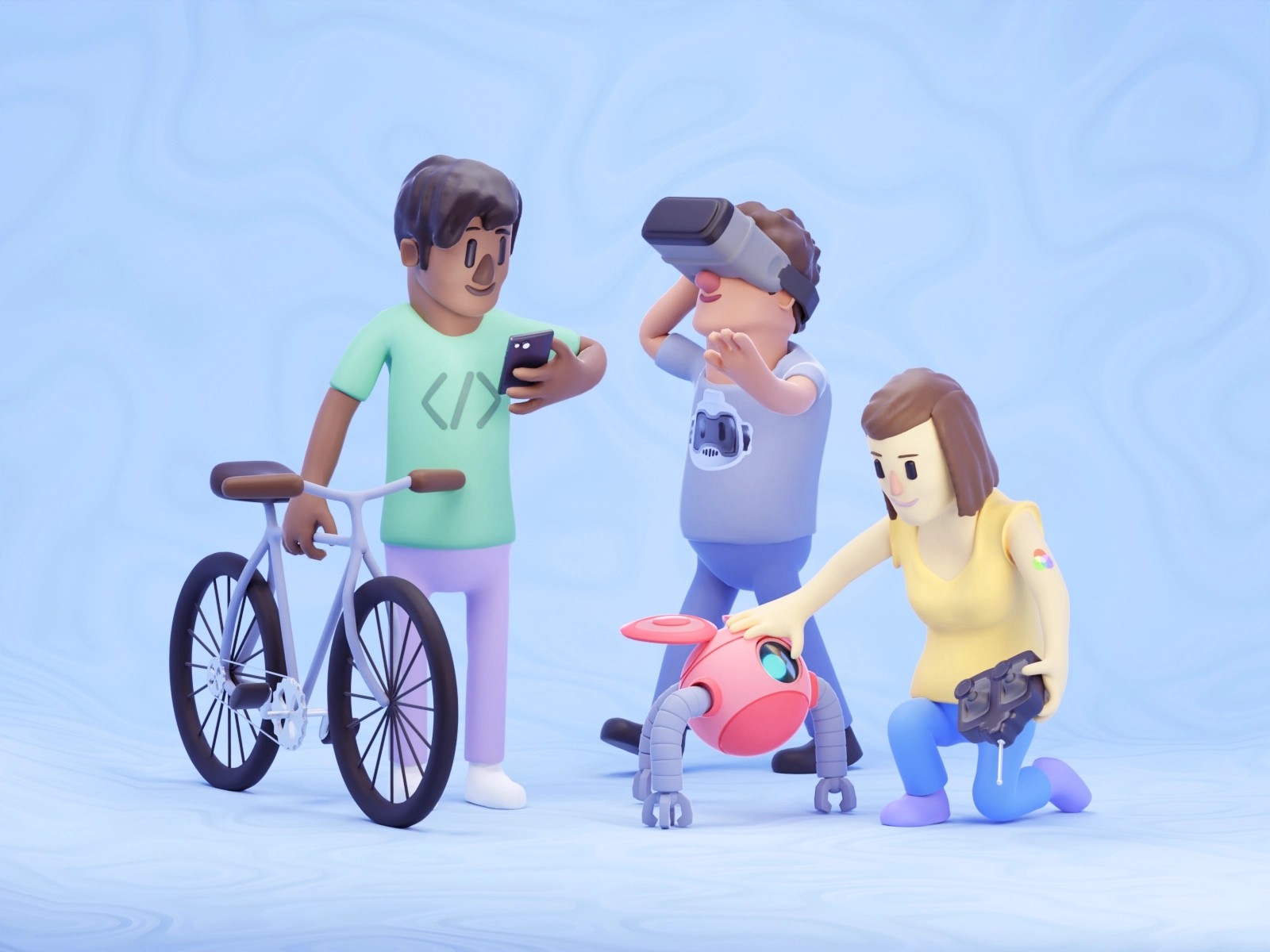
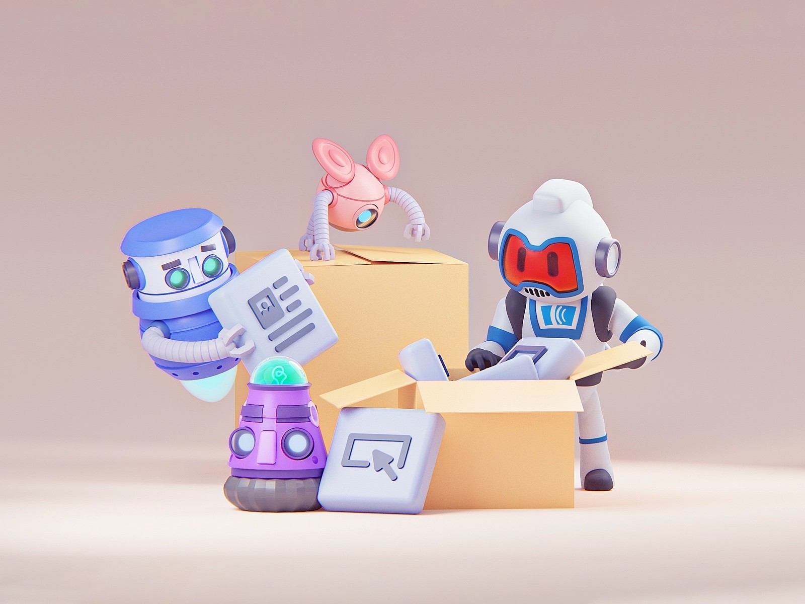
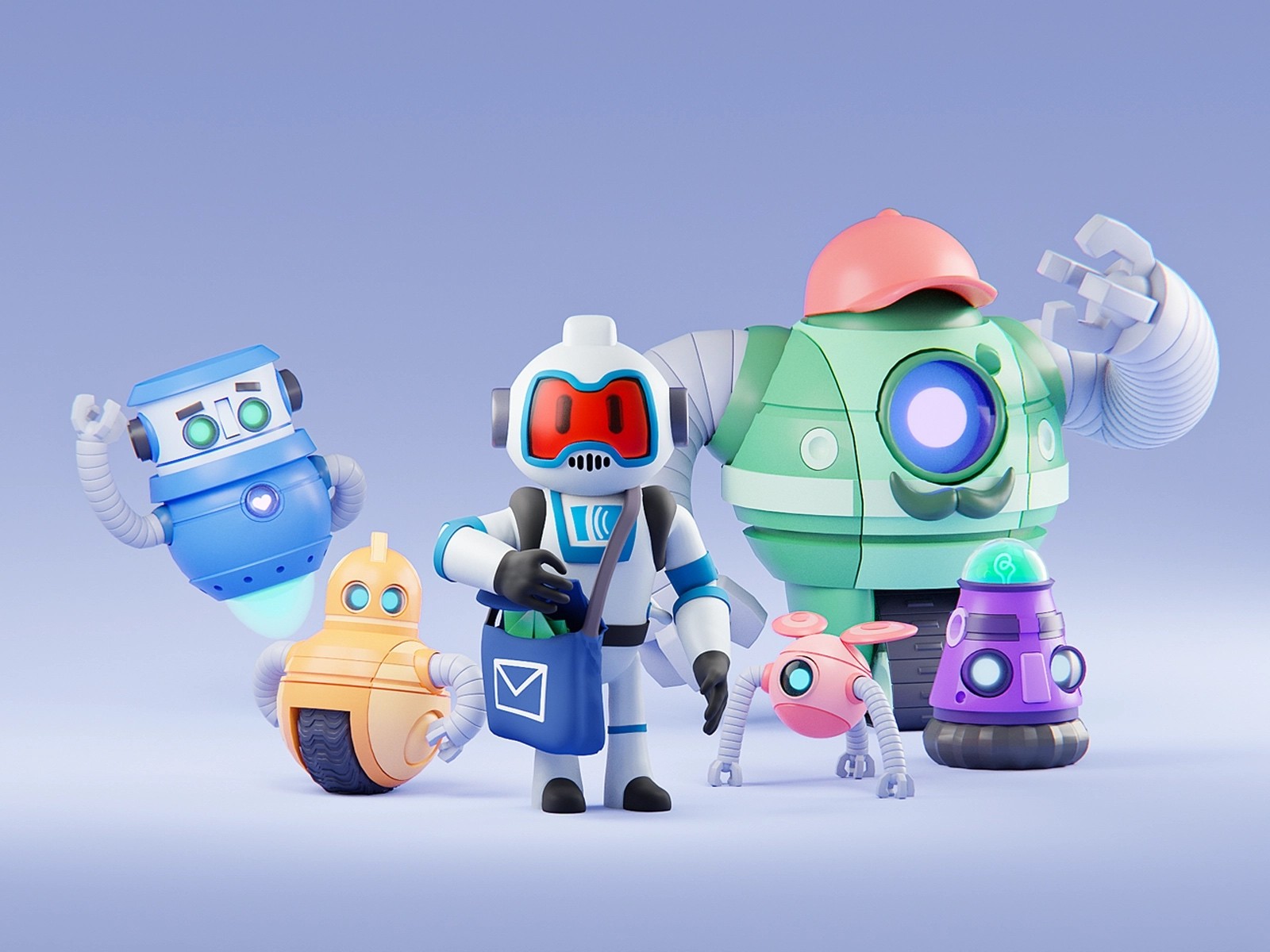
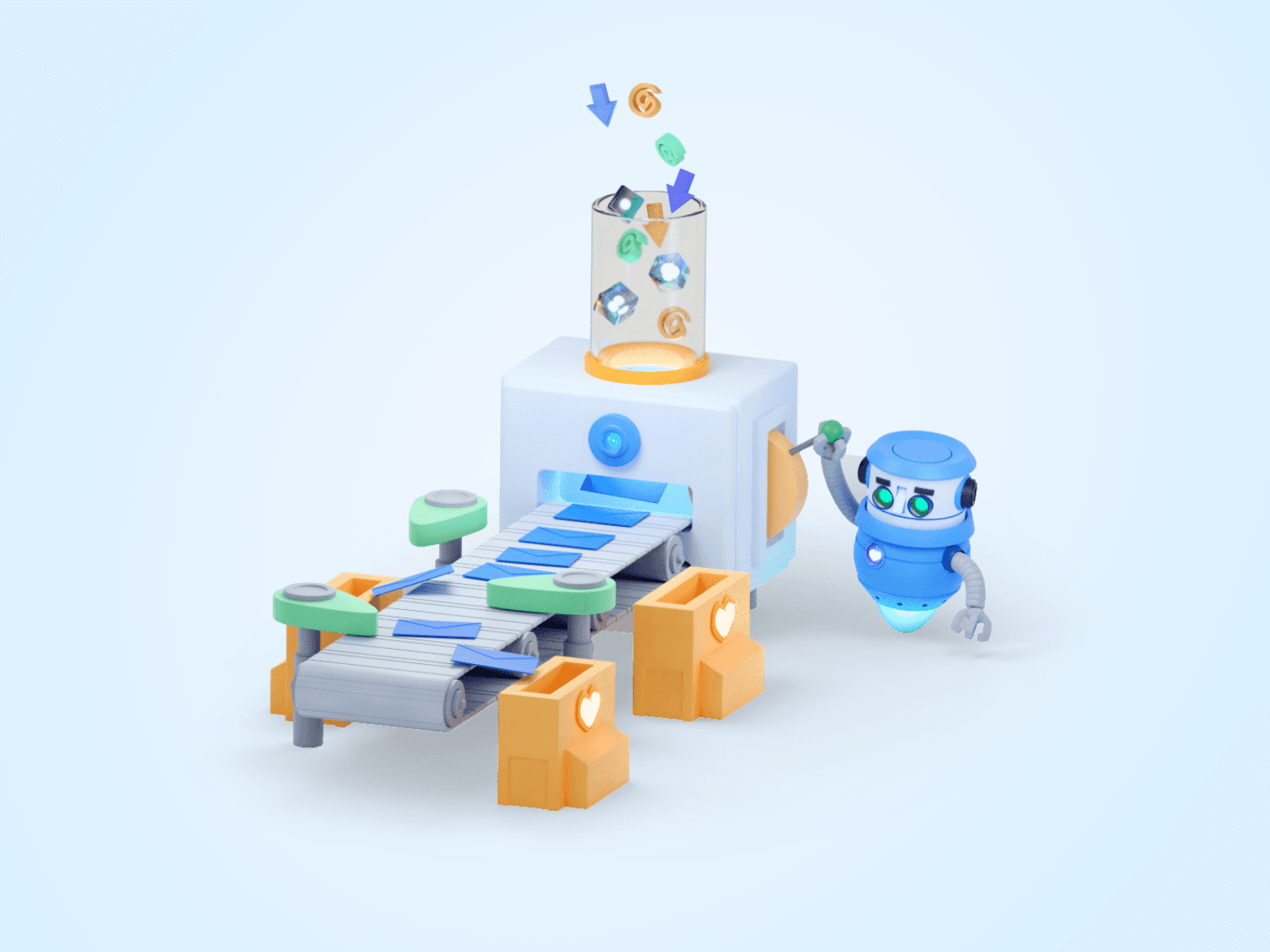
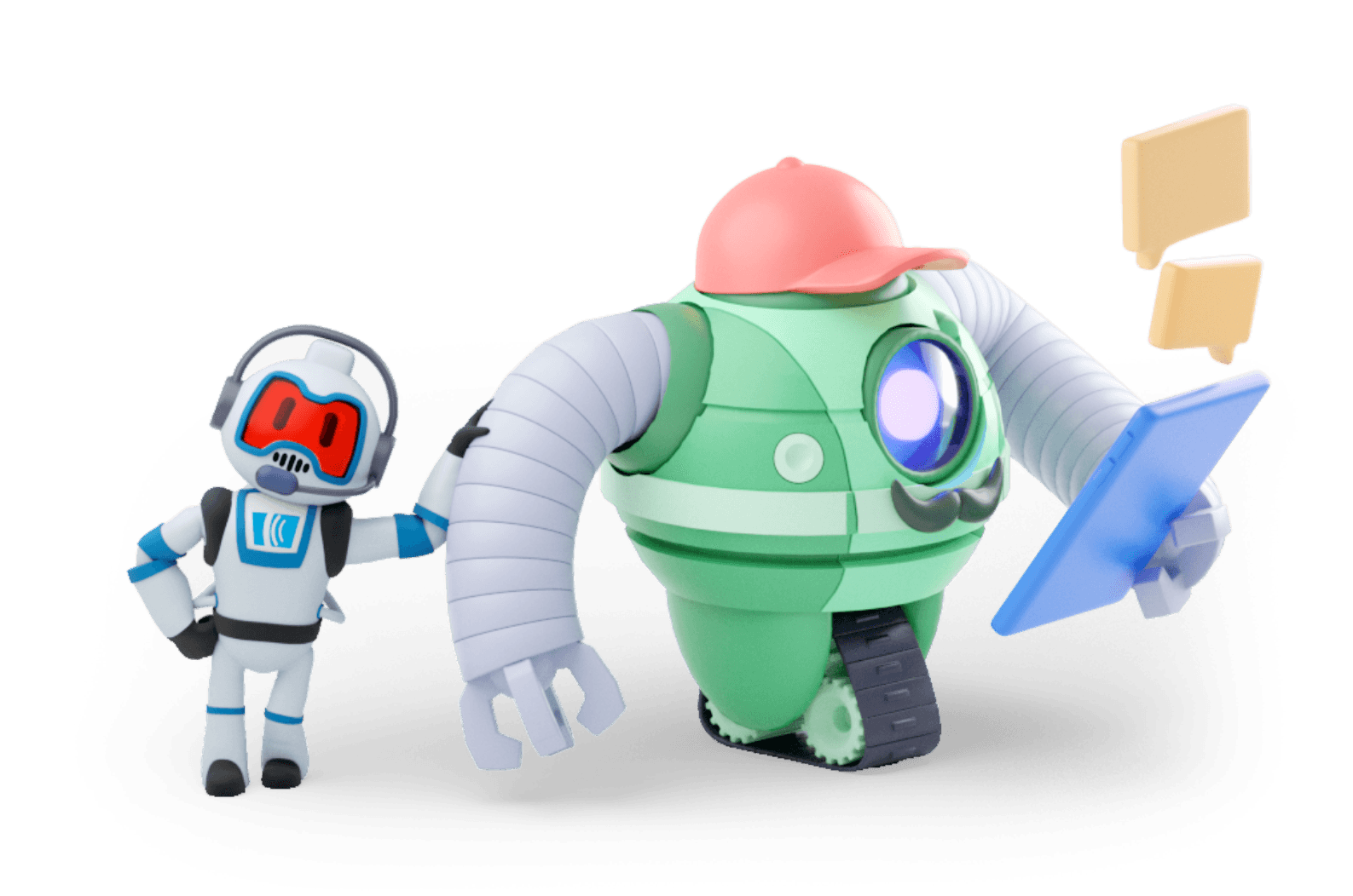
AJ and The Automations
A major pillar of the brand refresh was spotlighting AWeber's new suite of automation tools. To bring these features to life, we reintroduced the company mascot, AJ, to serve as a relatable avatar for our customers. We then surrounded him with a lively new cast of characters known as "the automations," designed to illustrate just how effortless the platform is to use. I designed the characters and modeled them in 3d. The following renders were used across the marketing site, in the customer platform, and in various social and newsletter updates.
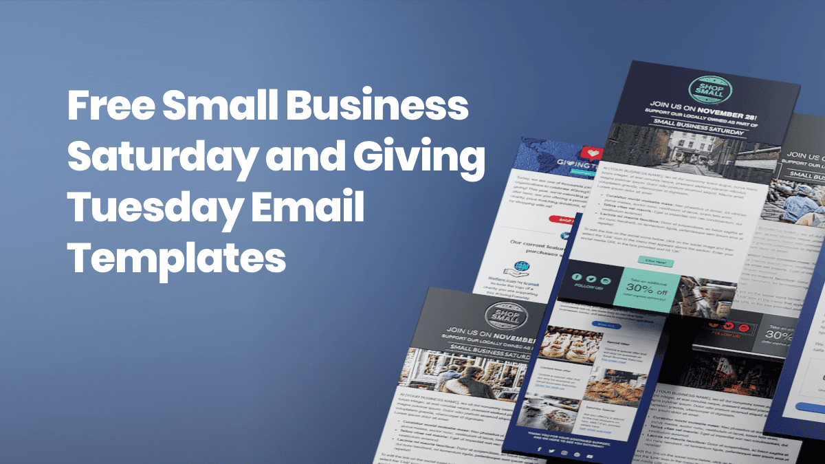
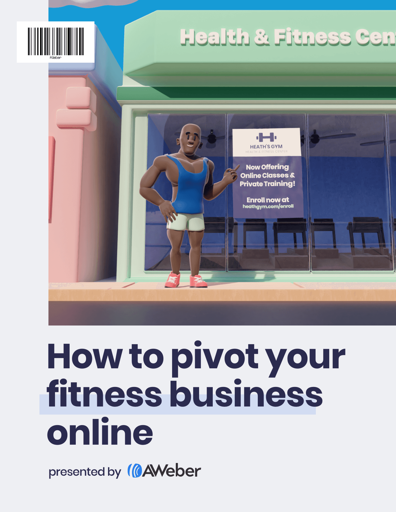
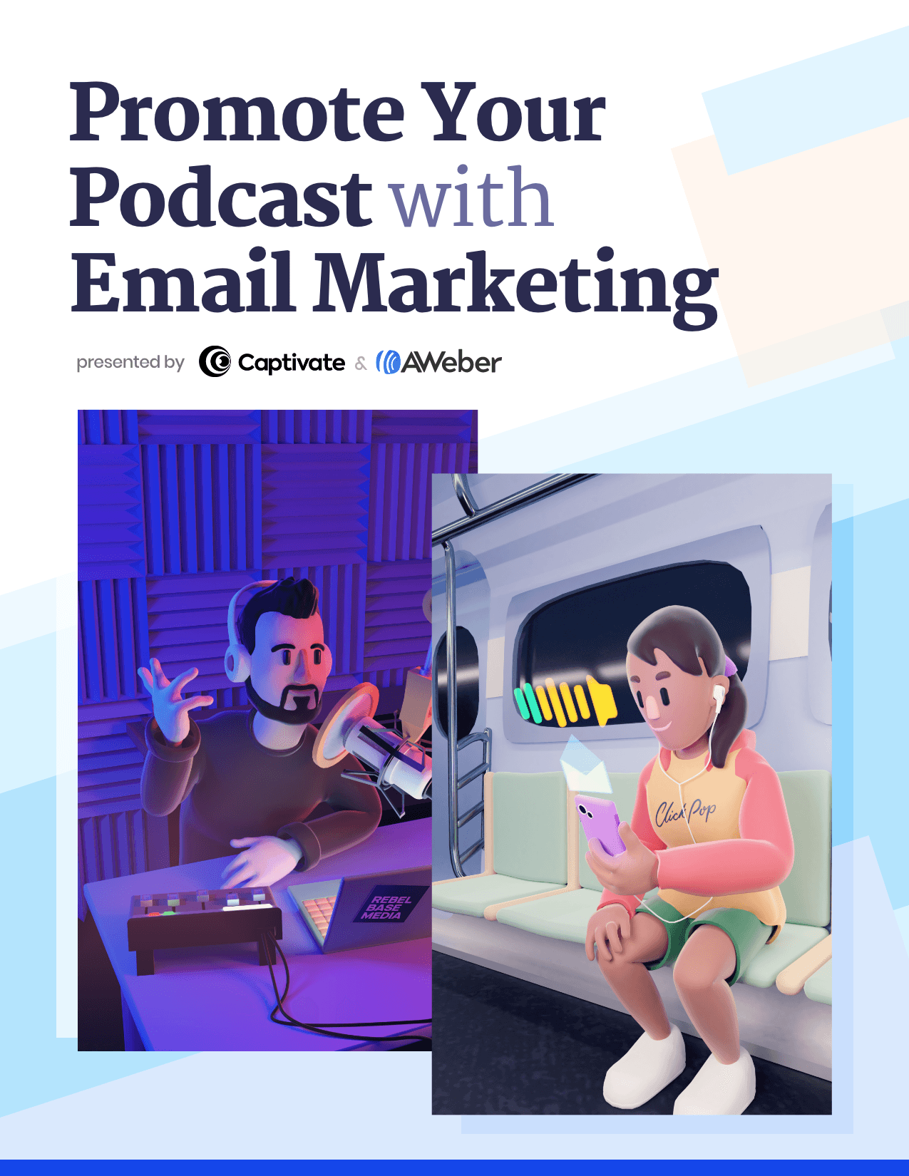
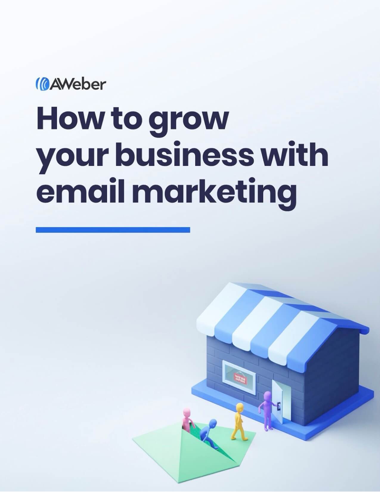
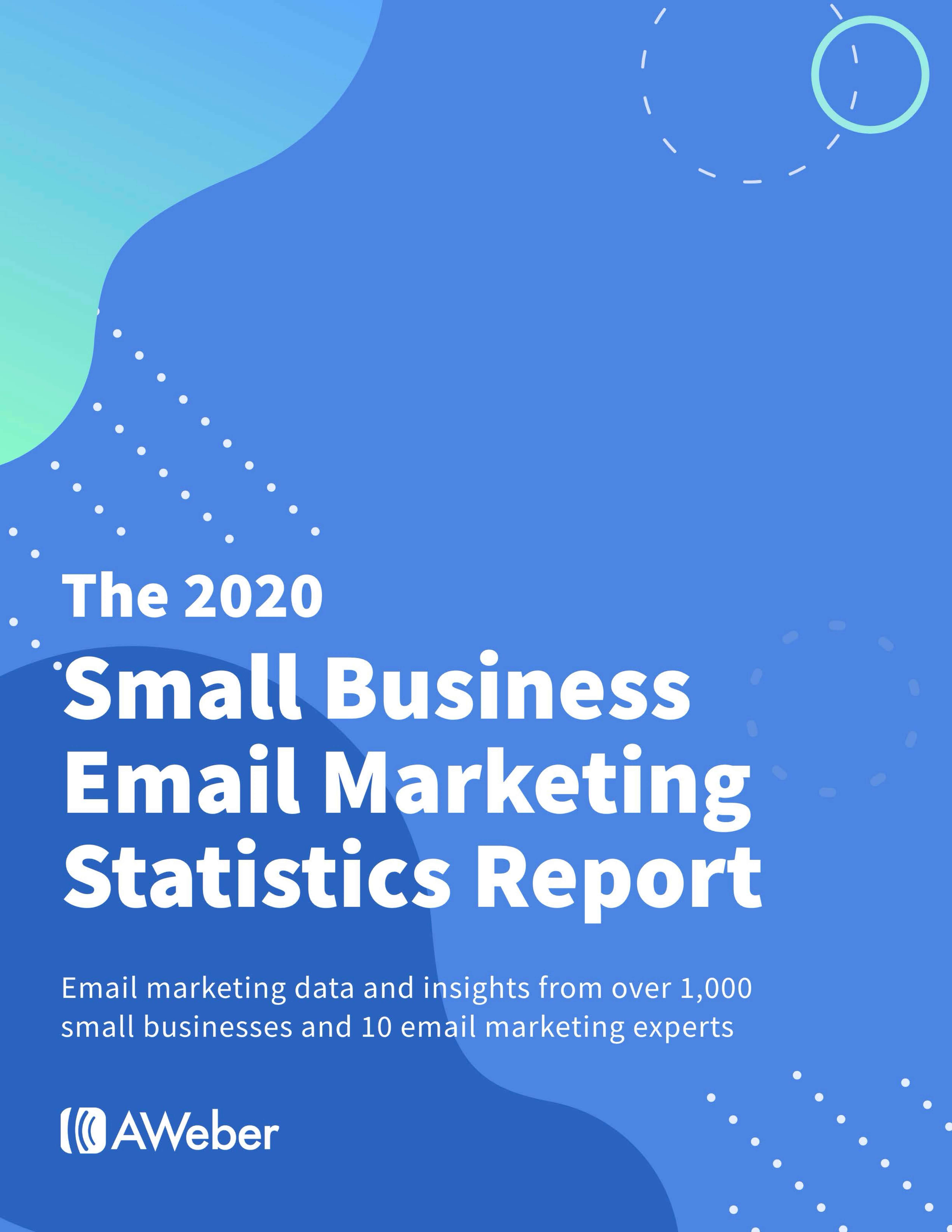
Marketing guides
To establish AWeber as an educational powerhouse, we launched a series of premium digital marketing guides. I partnered directly with our copywriters to translate deep industry insights into striking covers and highly engaging layouts. I also designed and developed dedicated landing pages to capture downloads and supported the rollout with targeted social media campaigns and newsletter features. Packed with actionable trends and real world success stories, this resource hub accomplished exactly what we set out to do. It became a massive growth engine that drove new account sign-ups while helping existing customers unlock the full power of the platform.
Cover samples
Guide sample
Guide landing page sample
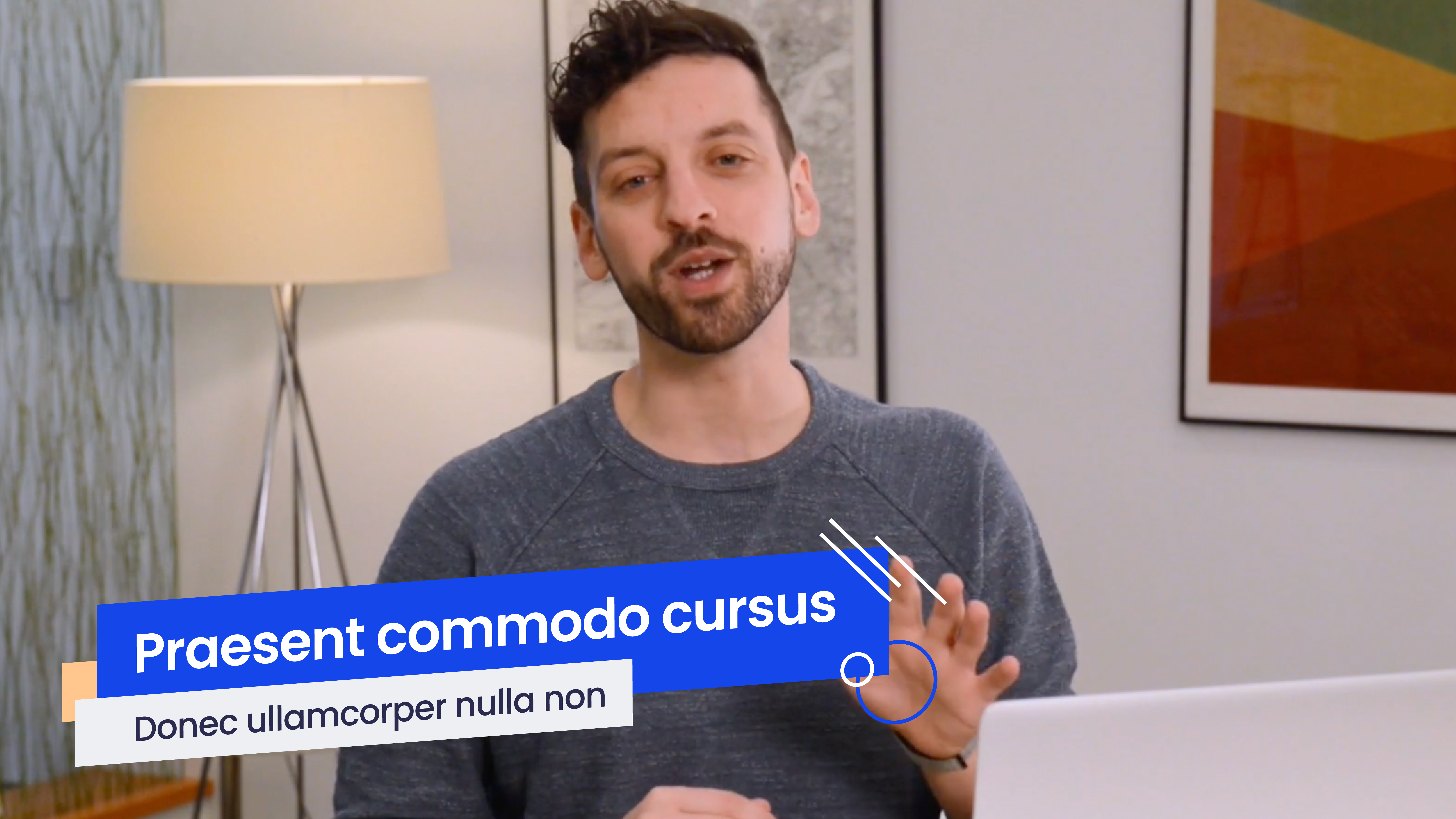
Video
With video serving as a daily driver for AWeber through live streams and evergreen content, our visual identity needed to translate flawlessly to the screen. I partnered with the video team to elevate their explainer and announcement series by designing a comprehensive suite of motion assets. By creating custom chyrons, title cards, and motion templates, I ensured our visual experience remained completely cohesive. The aesthetic flowed seamlessly from the very first click on a paid ad straight through to an in-depth product walkthrough.
Video covers
Impact
I helped a 25-year-old company stop looking like one. By redesigning nearly every touchpoint a potential customer landed on, I increased first-time user sign-ups by an average of 6% and drove measurably better conversions across the board. Beyond the core marketing pages, I built two distinct customer-facing portals and established a striking 3D visual identity that set the brand apart in a crowded market. With the new mascot assets serving as the recognizable face of the product, the entire user journey became seamlessly unified. From a paid search ad to a help portal to a weekly blog post, the brand finally showed up as a aware and engaged with its customers.